
April 26, 2018
Colour Me Happy
So what exactly do I mean by ‘colour me happy’? Put simply, I am a great believer in how our choice of colour in our interiors can make us feel. Think about it…what is your favourite colour and why?
I’ll start the ball rolling. I LOVE yellow. It makes me think of sunshine and holidays. It’s an energising, uplifting and welcoming colour. So if it makes me feel this good, then why on earth would I not look to it when decorating my home? Having said that, I couldn’t possibly live with a room that was painted yellow from floor to ceiling. It would be overwhelming and unpleasant to be in! So how exactly do we strike the right balance?
The simple trick is to look towards neutrals for the base of a scheme, and add the colour in fun and interesting ways to create rooms that appeal to the senses but don’t overwhelm them.
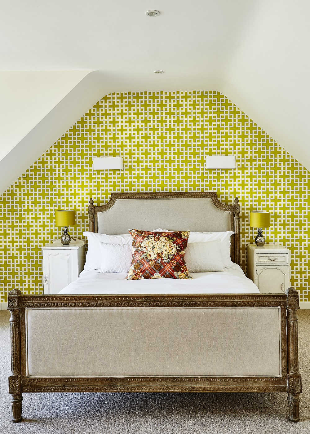
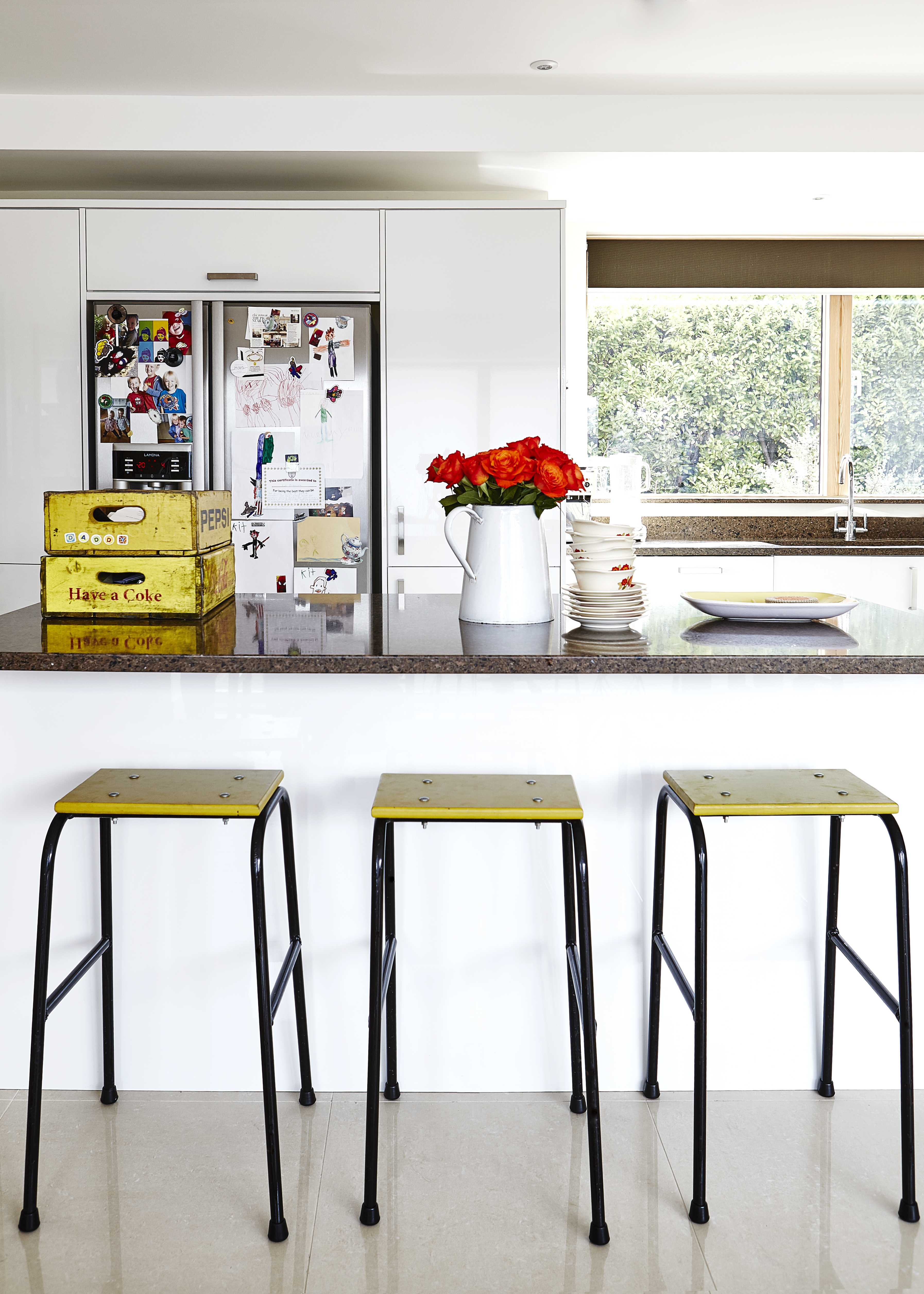
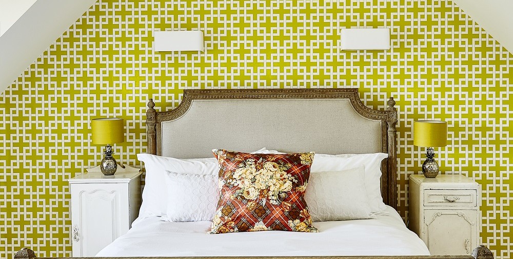
In these two rooms I have used yellow as a strong accent colour within a neutral scheme. In the bedroom, the wallpaper and lamps only make up 25% of the overall scheme, and in the kitchen, this yellow ‘pop’ of colour is even less, but it brings both rooms alive in equal measures without tipping the balance of the overall schemes. It is also important to note that a touch of red in each room makes the whole scheme sing! Put your finger over the cushion and then the flowers. Do you notice the difference if you take the colour away?
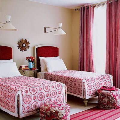 Talking of red, a colour that is associated with love, warmth and comfort, what better place to play around with it than in the bedroom? This glorious scheme uses blocks of colour and a boggling variety of patterns which really shouldn’t work together, but really do, due to their neutral backdrop. Paint the walls red, and you’ve lost the drama completely and the space would feel claustrophobic. (Image via Pinterest)
The most successful room schemes, in my opinion, get this colour balance exactly right regardless of the number of colours they employ. And they are the more interesting for their clever use of pattern and colour mix.
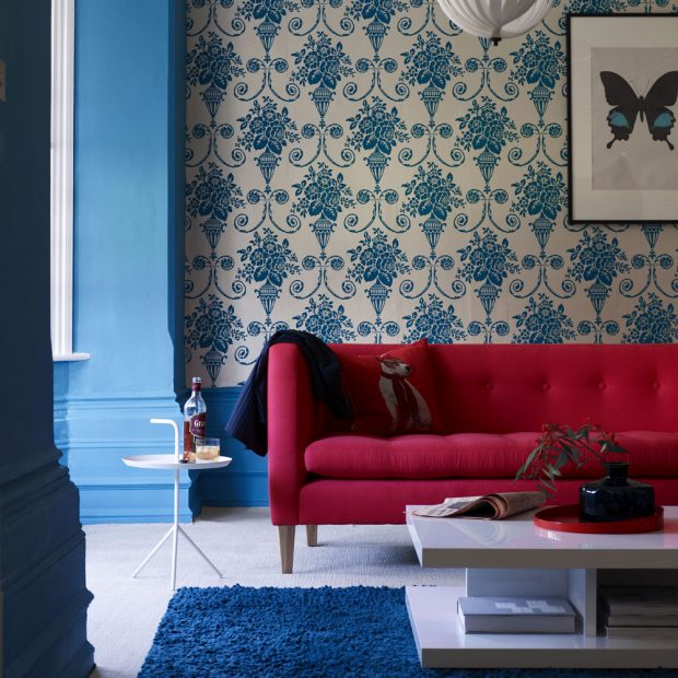
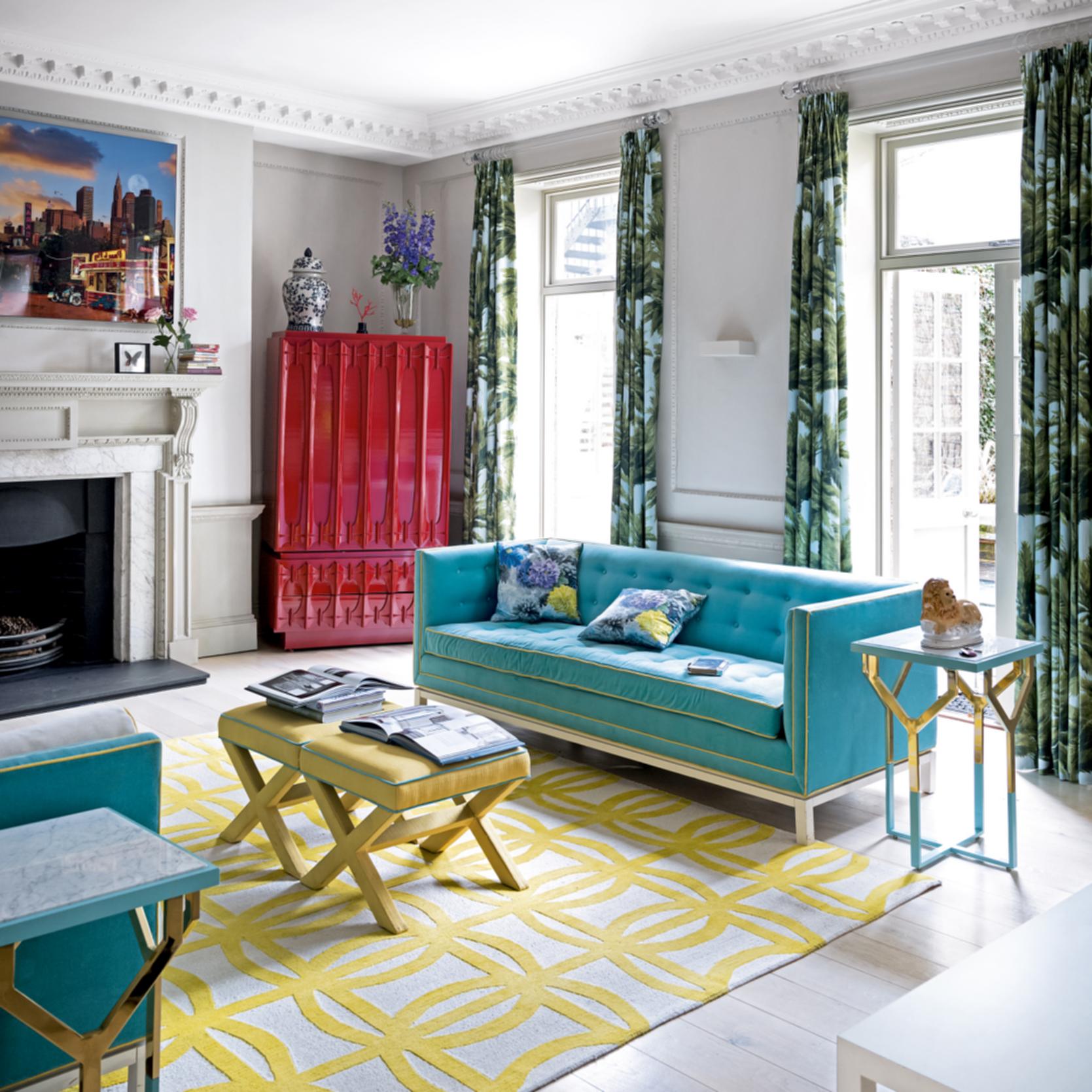
Blue is considered calming, relaxing and serene, but it can also be a cold colour when used in isolation. This scheme is brought to life by the clever injection of warm red, immediately elevating it from the fine to the fabulous in one hit! (Image credit Polly Wreford)
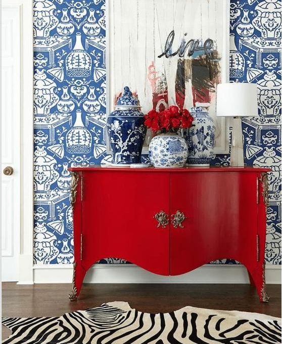
This image is another great example of how red an blue can work in harmony to create dramatic results. The simple message here – be brave with your design choices and the effect can be stunning. (Image via Pinterest)
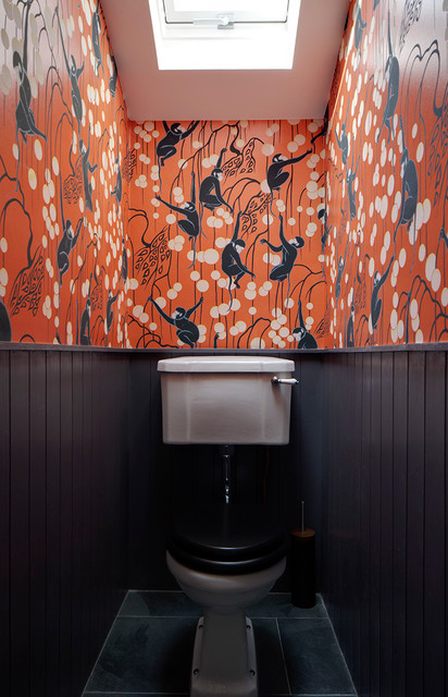
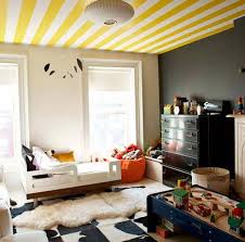
I truly believe that great interiors are born from a combination of passion and bravery. It is so important to love the spaces you create, otherwise really, what is the point of decorating at all? We can all create neutral, uncontroversial interiors that are functional for every day life. But it is also possible to step away from the rule book and throw caution to the wind in an attempt to create beautiful spaces – ‘Never use dark colours in small spaces’ (image via Houzz). ‘Always keep to neutrals on the ceiling’ (image via Pinterest). ‘Too many colours can make a room look busy or cluttered’ (image credit Paul Raeside)…
Just look at what can be achieved when we rebel just a little bit! Layering up colours and patterns that really shouldn’t work together can result in the most amazing spaces which can really stimulate the senses and elevate your mood. Colour me happy indeed!