June 24, 2020
How to make your home instagrammable!
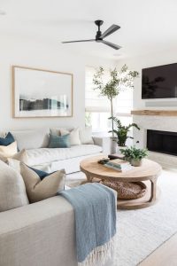
Featured image: @Jenny.branson.interiors
Your Design Questions Answered: Could you give me some simple tips to make my house look instagrammable?
Firstly, don’t be fooled by all these images that you see on Instagram or in interiors magazines. In the majority of cases, this is not in any way a reflection of how people live in these spaces! They have been styled, set up for photoshoots and primped and preened to perfection before making it onto the grid. These people have kids and pets, they eat off these surfaces, they even sometimes sit on their sofas!! These images are not generally a reflection of real life and indeed, much of the time, mountains of clutter is hidden behind the camera to create the perfect shot.
However, there is still something glorious about scrolling through all these beautiful images, so here follows a few pointers to get you in the running for interiors insta-fame.
De-clutter & clean!
Nobody wants to see trailing wires, dustballs, finger prints or unwashed dishes. Save the reality for your stories! Before you take your shot, make sure you get your space sparkling clean and free from any unnecessary clutter. Too many bits and bobs will only confuse the image and detract from the impact you are trying to make.
@houseonsugarhill
@sugarandcloth
@puresaltinteriors
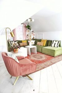
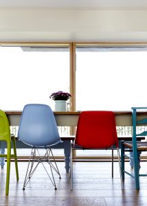
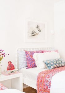
Bring on the colour
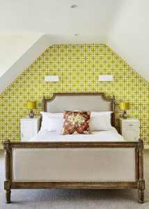
Think how quickly you scroll through your insta-feed. What stops you in your tracks? It’s very easy to overlook another neutral interior even if it is beautifully styled. Try injecting some colour into your spaces to catch the roaming eyes. Think chairs, cushions and throws in bright hues and interesting patterns. They can do wonders to lift a white duvet or neutral sofa. Look to creating a feature wall in your room. You don’t have to cover the space in wallpaper, but one carefully chosen wall can bring focus to your image and immediately elevate a space beyond the pale.
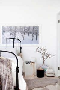
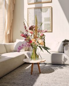
@Jenny.branson.interiors
@Jenny.branson.interiors
@Jenny.branson.interiors
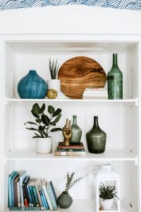
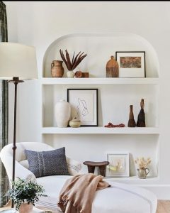
Shelfies
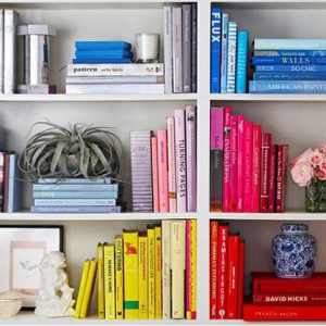
This is insta-speak for a curated collection of items that sit on shelves or flat surfaces around your room. These are fabulously popular on instagram – search #shelfie to see what I’m on about. Remember to arrange items in odd numbers (work up from 3) and work with a similar theme like glass vases, photo frames or sculptural objects which vary in size and shape to create interest in the grouping. You could even colour code your books – this is a great way to use existing props to give your space the wow factor.
@thesteinitz
@amberinteriors
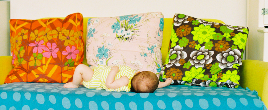
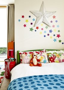
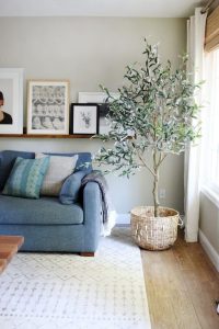
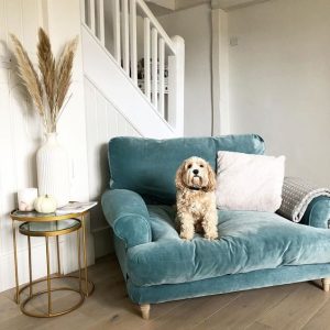
Add some life
Plants – faux are absolutely acceptable, no-one will know! Beautiful flowers arranged in vases, pets, babies – insta loves a bit of interest, especially if there’s a story behind the image that you can capture in your accompanying text.
@chrislovesjulia
@bloomonuk
@loafhome
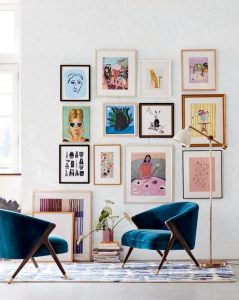
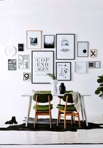
Gallery walls
This is a collection of framed photos or artwork grouped together on a wall. These help to tell your story and give your audience a through-the-keyhole insight into your world. Again, make sure your groupings and colour theme makes sense – all black and white photos, all vintage frames, all abstract artworks or all portrait paintings for example. And pay attention to the space between the images – make sure this is uniform or it will just jar on the eye. Instagram loves and gallery wall, and done right, you are bound to get the thumbs up.
@anthropologie
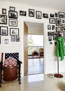
@Jenny.branson.interiors
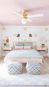
Seasonal decorations
By this I don’t mean you need to put up a load of tinsel at Christmas! The four seasons naturally have very distinct colour palettes, and you can work with these changes in your home simply by switching up your bedding, cushions, throws and even rugs or curtains. Spring is all about fresh bright colours, summer a more muted palette, for autumn rich and cosy hues, and winter crisp and bright. Use the same cushion fillers throughout the year to minimise on the need for storage. This obviously works best if you are layering from a neutral base – please don’t start adding bright cushions to an autumn scheme – it will look awful, and certainly not insta-glorious!
@thehappilyeva
@zdesignathome
@rebeccaandgenevieve