
April 24, 2019
Colour Crush – How to decorate with bold colours…
Feature image: www.sophierobinson.com
Embracing colour, especially very bold tones, can be a scary prospect. If you have a tendency to keep to neutrals in your wardrobe then this probably spills over to your interior choices too. Here I show you how making the leap to the dark side needn’t be so daunting…
www.2lgstudio.com 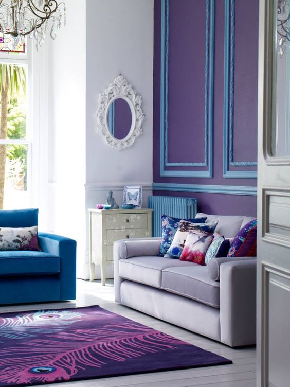
www.cafesilvestreut.com 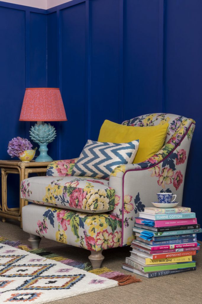
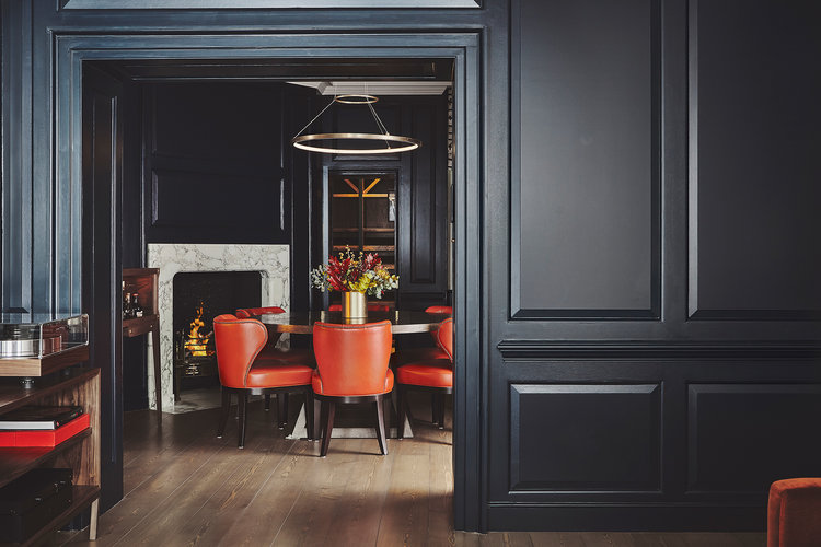
www.chrissnookphotography.com
Used in the wrong way, colour can be overpowering or claustrophobic, but get it right and the effects can be amazing. Paying close attention to proportion and scale is key to making sure you don’t end up with too much of a good thing. Colour choices should also flow well throughout your home and not result in a patchwork of different looks.
If in doubt, keep in mind the fail-safe 60/30/10 rule to achieve the right percentage colour balance. Here, the ‘hero’ colour will take up the majority of the room – don’t just think walls, this can also be flooring or large pieces of furniture. Next comes the slightly bolder ‘secondary’ colour taking up 30% of the space, and finally the bright pops of ‘accent’ accent colour to bring the whole scheme alive.
www.annahewitsondesign.com 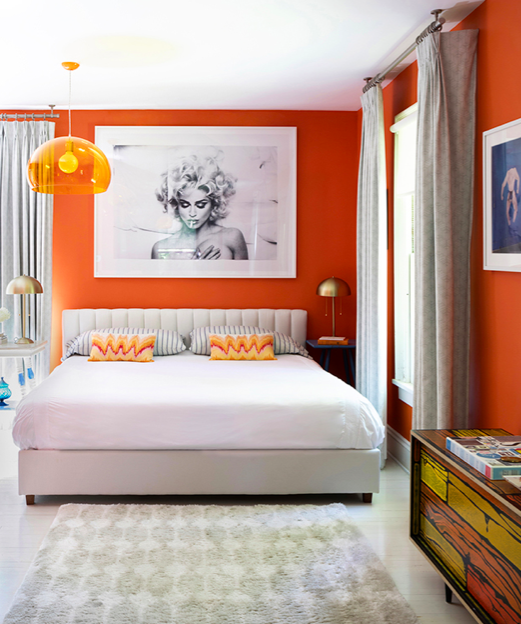
www.thenovogratz.com 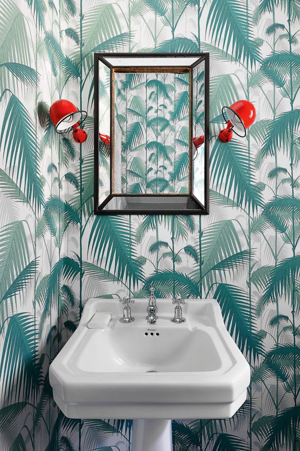
www.turnerpocock.com
Bold colours work best if they have something to play off, but how do you know which colours will sit best together in a room scheme? Enter the colour wheel, a really handy design tool that takes the hard work out of deciding which colours will combine well in any given scheme.
‘Triadic’ colour schemes use three colours that are evenly spaced around the colour wheel. This bold approach to decorating is ideal for kids rooms.
Using a selection of ‘Analogous’ colours which sit next to each other on the wheel adds real depth and drama to a scheme.
‘Complimentary’ colour schemes use colours on opposite side of the wheel which pop when contrasted with each other. For a softer approach to these colours, use a neutral backdrop and contain the bold colours to accents within the space.
www.jennybranson.com 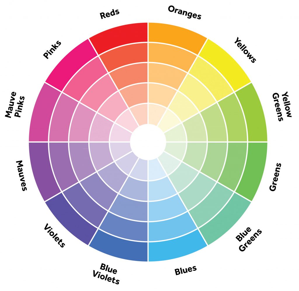
When honing in on colour, think about how you want your room to ‘feel’. Are you looking at creating a bright, airy space or a warm and cosy ambiance. For the latter, look at colours with yellow and red tints in them. For a lighter effect, look to the cooler blue family.
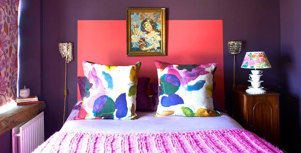
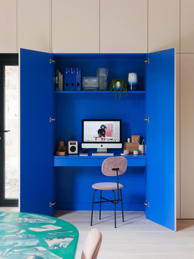
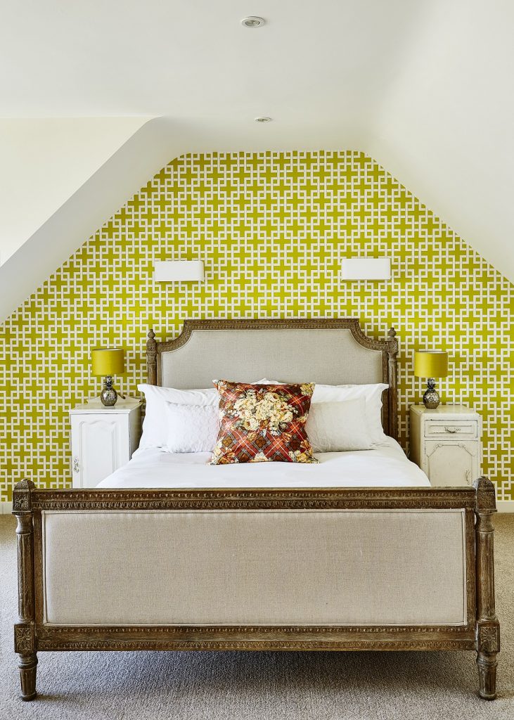
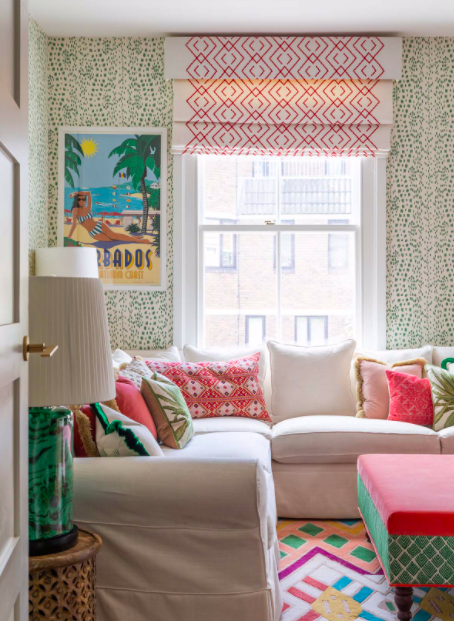
If you’re still not convinced about going all out with colour on all four walls, you might want to think about ‘Colour Blocking’. This technique introduces colour through ‘feature’ walls using a fabulous bold wallpaper or a punchy paint in small but fiery doses. Think about what you want to draw attention to in your space. The wall behind the bed and the chimney breast in a living room are obvious starting points. But this technique can also extend to the area between floor and wall hung kitchen units, or even focus on a statement floor tile.
Small rooms are also a great starting point to get your confidence up. This is where people tend to go neutral to try and create a feeling of space, but you can create real drama with some bolder design choices. The current trend for daring decorating in the downstairs loo has never been so rife!
www.barlowandbarlow.com 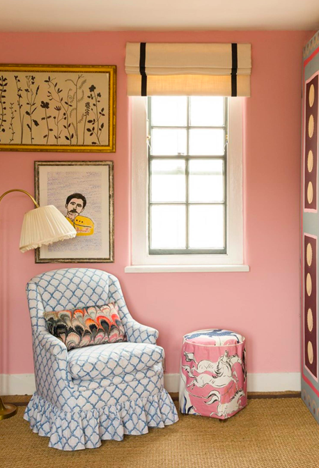
www.beataheuman.com
Don’t be afraid to add in a dose of pattern too. In a room featuring bold colours, pattern can be used to bring the whole design together by unifying the colour palette in one hit. Look for patterned rugs, cushions, throws and, if you’re feeling brave, a statement accent chair or bold headboard to give a real focal point to the space.
You can also try starting your colour scheme with a swatch of patterned fabric or wallpaper that you are drawn to. You can be safe in the knowledge that the designers have done the hard work and you will already be working with a palette of colours that sit well together.
When you are decorating with bold colours, neutrals are your secret weapon. They don’t appear on the colour wheel, they all go together and they give the eye respite and provide the space for their brash cousins to shine. But be careful to select the right neutral tone to compliment your brights. For instance, warm colours need a white with a yellow undertone and cooler colours need a white with a blue undertone. Get it wrong and your warm whites will read yellow against bright blue, and cool whites will seem grey or dirty next to warmer orange.
Remember that all colours form relationships with other colours so it’s very important to print off pictures of rugs, furniture and accessories and sit them next to your paint swatches to see the full effect before making a commitment. And always live with paint swatches on all four walls of a room for a few days before taking the plunge. The level of natural light will affect the paint colour in different ways throughout the day.
For more interiors advice and inspiration, follow Jenny on Instagram and visit JennyBranson.com
bold colour, colour, colour clash, colour your home, colourful interiors, colourful kids rooms, colourwheel, decorating with colour, interior design advice